Posts tagged creative workshop
Semester V | Color Calibrations for In-House Printing
Design House Prep School | A School For Creatives | Online Creative Courses

Color Calibrations

for in-house printing


Without a doubt, the questions we get most often are regarding printing.  We do most of our printing in-house and have since our inception ten years ago.  

Many stationers are going the route of investing in an awesome printer and handling all their printing needs within their own studio.  There are so many advantages to being able to control this integral part of your production process yourself, but there can also be some major drawbacks.  Learning the ins and outs of your printer’s personality, what types of paper it likes and doesn't like, how long it takes to complete projects, etc. is all a major learning curve, but nothing compares to the learning curve of color adjustments.  

Have you ever printed something straight from Illustrator or Photoshop and it looks nothing like your digital file?  The colors are all wrong, they're muted and muddy, reds are browns, blushes are orange and dark greens are black.  Know that frustration?  This course will walk you through making color adjustments specifically for printing in house and will walk you through adding adjustment layers, running test prints, identifying issues and correcting them.  

Full disclosure, we will NOT be handing you the exact solutions for your very specific printer problems. Odds are, you have a different printer, a different computer monitor, a different paper… even a difference in the weather can change how your prints come out! What we WILL do is walk you through the same questions and best practices we go through for any in-house printing project that we do ourselves. We want you to walk away from this course with the tools and the confidence to troubleshoot any printing issues that come your way, no matter the specific circumstance!

Semester V | Venue Illustrations
Design House Prep School | A School For Creatives | Online Creative Courses

Venue Illustrations

Historic museums, exotic castles, nostalgic homes — our clients put a lot of thought into the venue of their event. Dreamy venue illustrations are an excellent way to acknowledge their efforts add a personal touch to any project you create.

In this course, we're going to learn to illustrate a venue two ways: the hard way, and the easy way. We'll be learning one and two point perspective and learn how to illustrate a building the old fashioned way: with pencil, paper, ruler and eraser. Although this is the time consuming route, it's always important to know the technique before you learn the shortcut. During the second half of the course, we'll learn to do it the quick and dirty way so you can spend less time illustrating and more time creating.

I'm all about working as efficiently as possible and getting work done as quickly as possible while still maintaining the integrity of the work.  Sometimes, this means creating and accepting shortcuts.  I have zero shame in utilizing these shortcuts, but the best way to learn a shortcut is to make sure you understand the long way first. 

Master Class | Scarcity Mentality

Sometimes there just isn't enough to go around...

When we feel like there isn't enough work to go around, we end up jumping on any and everything that comes our way.  We live with the feeling that we just don't know when or how or from where our next job is coming from, so we better take what we can get while we can get it.  It doesn't matter if the work isn't what we want to be doing, isn't our style or our ideal budget, we still have to take it.  

So we take it all.  We're overwhelmed, our dream job is making us miserable, we're working insane hours (night and weekends included), we're anxious, we're working with terrible clients, we have no idea why we decided to take on this crazy idea of owning a business.  

...and the worst part?  We're still not really making any money. 

Most creative business owners answer the same...we just have to take on more clients and work more hours. 

Design House Prep School


...short term

When living with scarcity mentality, we focus only on the short term and what we think is available right this very second without any thought to how it will affect us in the long run.

...ignore the long term options

It's extremely difficult to plan for the long term when our short term scarcity mentality has us scrounging for every little penny every day and unable to focus on the long game.

...jealousy and sadness

When we are struggling so hard to make ends meet and dread getting up every day, we end up becoming envious of others around us who seem to be experiencing successes and happiness. The comparison to our own lives breeds sadness and jealousy. 


So how do we overcome living like this??

- We can start by defining the work we want to be doing and why.

- Taking a good look at our target market and making sure our aesthetic and work has a market to sell to

- Building a brand that stands for our aesthetic and price point

- Market to your target market

- Building strong industry relationships
 
- Define your ideal client and seeking only to work with them

- Learn to say no

- Learn to set boundaries


We go into detail in our Pricing for Creatives I course if you're interested in learning more! 

NEW CLASS! >> DIGITIZING CALLIGRAPHY & WATERCOLOR

Do you have awesome artwork or calligraphy skills on paper and no idea how to translate that to the computer? Digitizing your work is the first step in translating your beautiful artwork from paper to pixel.

With a digital copy of your work, you can use your hand-done artwork in layouts and designs, create prints, get products made, use it in your branding and online presence... the possibilities just open up! Digitizing can mean the difference between restarting a whole project because your client changed their colors or just doing a couple tweaks on Photoshop and reprinting. It can mean that you do the same amount of work and maximize your profit when you sell multiple prints of your piece. It can mean you create your own custom patterns made from your own artwork (awesome!) and proceed to use those patterns as wallpaper, fabric, envelope liners, you name it! 

We'll be starting at the beginning and walking you through scanning, editing and using calligraphy and artwork in your layouts and designs. This will be a beginner to intermediate course.

Although instruction will be using specific examples and methods in the Adobe Creative Suite (specifically, Photoshop), we do not require you to purchase Photoshop in order to take the course. The same principles could be applied to other photo-editing software, including free alternatives like GIMP. We do love Photoshop though (this isn't a sponsored post!) and it is often the industry standard, so we'd highly recommend taking advantage of the free trial from Adobe to see if Photoshop is for you. 

Course | Pricing for Creative Businesses II

Starting with our Pricing I course last semester, we offer a multi-part series on how to price your work in a creative business. Semester II brings the Pricing for Creative Businesses II. 

Design House Prep School | A School for Creatives | Pricing II

This second semester pricing course will dig a bit deeper into the world of pricing. We'll look at specific pricing examples in two industry categories: custom calligraphy projects, and building a pricing sheet as a paper pusher (i.e. stationer).

When we talk about pricing for custom calligraphy projects, this includes oddball projects such as large scale quotes, wedding vows, family crests, large menus, large seating charts, etc. We'll talk about how to price your time as well as the cost of product for these situations. In addition, we'll talk about building your pricing as a calligrapher and the different pricing structures that are available.

The second example we'll get into is pricing paper, printing, assembly details, and your time as a stationer. Having estimates of these costs will help to dramatically cut down the time it takes to return quotes to clients while ensuring accuracy in your pricing. 

As with all the other Semester II courses, registration will open on December 12, with class materials becoming available on January 13th! 

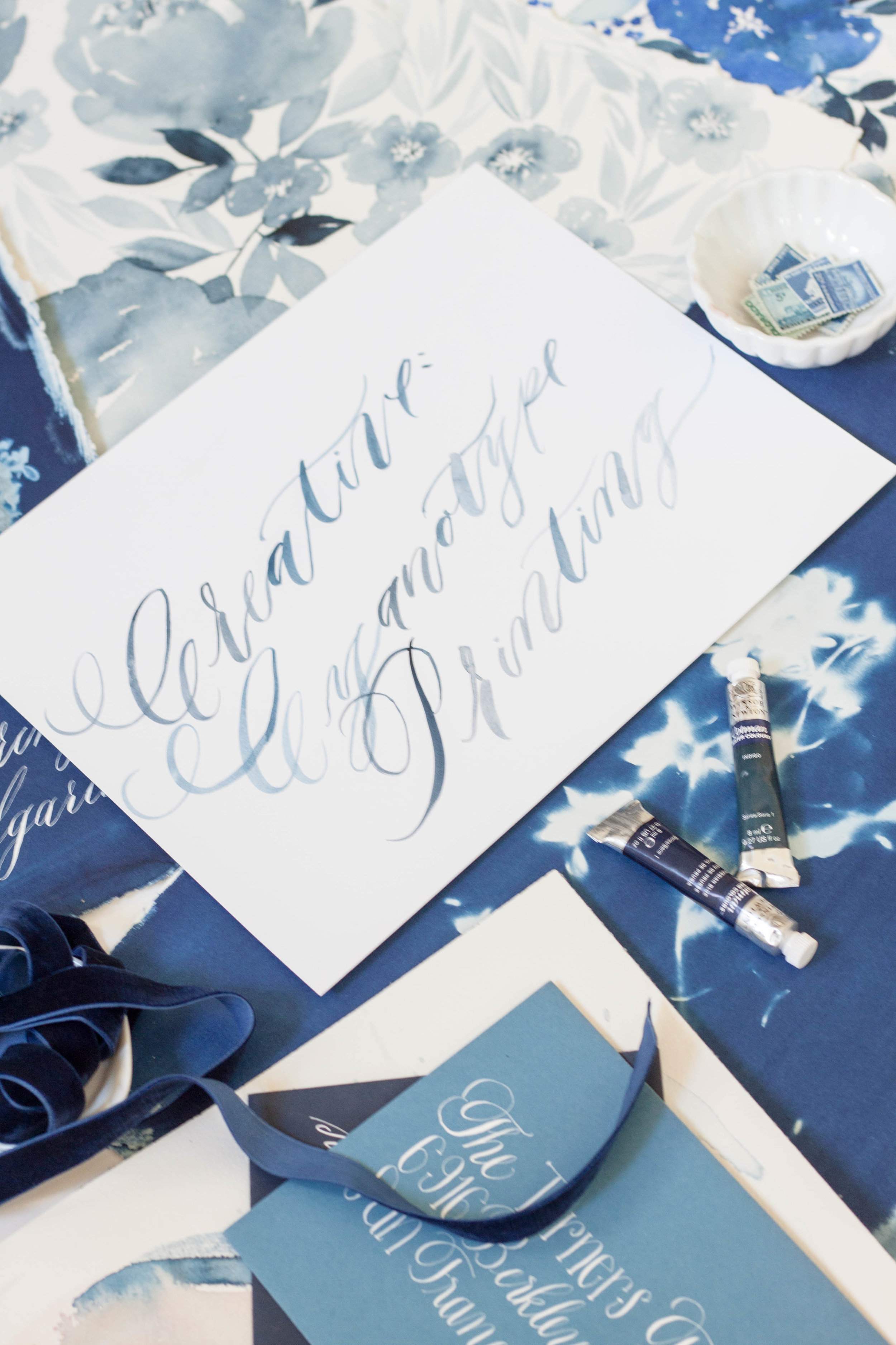
Course | Cyanotype Printing

We love to include interesting creative techniques in our course offerings. As creatives, it's so important to continue to explore new techniques and expand our horizons when it comes to our craft. For Semester II, we are offering Cyanotype Printing.

Design House Prep School | A School for Creatives | Cyanotype Botanicals

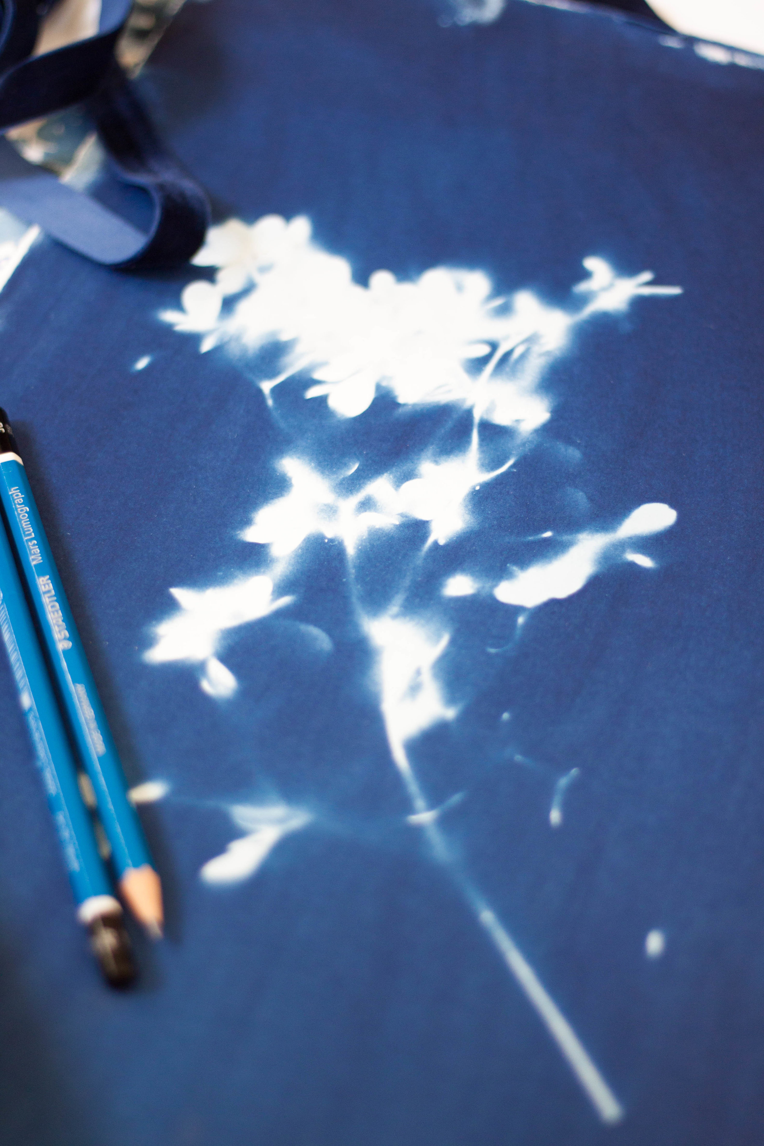
Cyanotype printing was a method of printing invented in 1842. With its origins in reproductions, specifically blueprints (hence the name), it uses the photographic printing and development process to create gorgeous cyan or prussian blue prints. 

Aside from using cyanotype printing on paper products, I have successfully used it to create lovely unique prints on fabrics, most recently a silk scarf. While it is a process that requires patience and time (and a dark space with no light!), the results are phenomenal. In this course, we will be learning the ins and outs of the process and create some botanical prints! 

Registration for Semester II courses will open on December 12, so mark your calendars! Classes will become available on January 13, 2017.